-
Bug
-
Resolution: Cannot Reproduce
-
None
-
1.2.0.9, 1.2.0.18, 1.2.0.81
-
None
-
Unconfirmed
-
Windows
Hello.
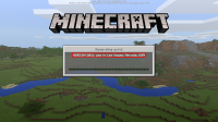
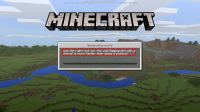
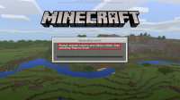
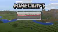
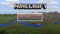
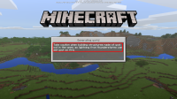
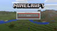
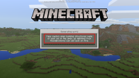
In the new 1.2 betas, I've noticed that the helpful and funny messages that appear in the loading world screen all have a different border, and some look off and out of place, and this makes the loading screen look unpolished.
So I took 6 screenshots, and named them according to the border of the text I could see. In those 6 screenshots, I found 5 different types of border. Some are closer to the center, some others are closer to the border of the gray "window", and some others are in between those. I uploaded these screenshots, along with a red border, to note where that text's border is. These are the attachements BorderType*.png.
Then, I made a quick mockup (attachement MockupExampleText.pmg) on what the border should be (so that the text looks consistent and polished), and made 2 more mockups to show how a short and long text would look with this new border (attachements MockupShortText.png and MockupLongText.png).
Basically, the new border right and left sides will be parallel to the right and left sides of the loading bar, and the up and down lines of the border will finish a few pixels before the gray area, and before the loading bar.
I hope you can get to solving this, so that this screens looks polished and nice.
